Ducks, pie charts, and the dreaded grid
A reflection on Edward Tufte's The Visual Display of Quantitative Information reveals my own disdain for graphical ducks and pie charts.
Oct. 23, 2025
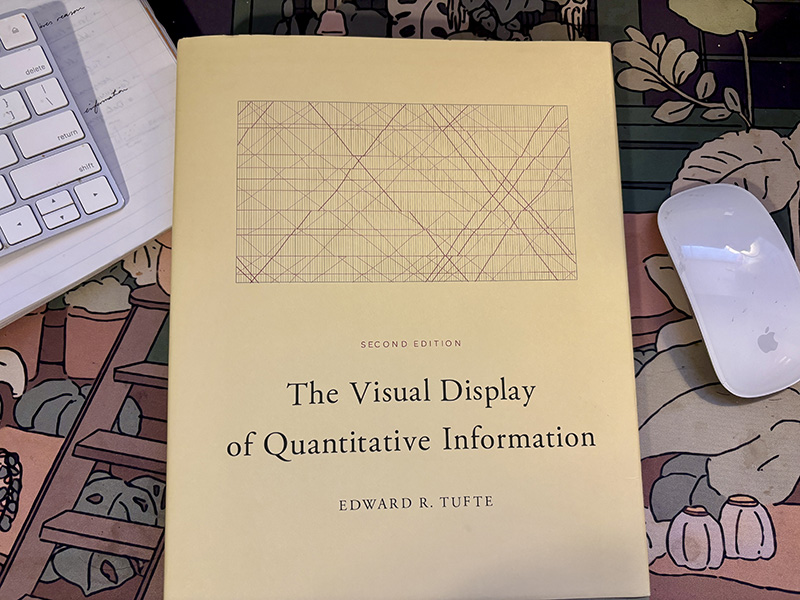
An image of the cover of Edward Tufte's book The Visual Display of Quantitative Information. (Amanda Weisbrod)
This reading reflection is the first of (hopefully) many in a series I’m calling Data Viz Diaries. I hope you’ll find some entertainment in my ramblings and are inspired to pick up each text yourself to expand your knowledge of visual communication. Let’s jump in.
In The Visualization of Quantitative Information, I found Tufte’s voice to be technical yet welcoming, with some phrases actually making me laugh out loud. “The only worse design than a pie chart is several of them” (p. 178) was one of those phrases. He states pie graphs are ineffective because tables are a better way to show exact numbers in a small dataset. I was never a fan of tables until I read his book, but it tracks, especially considering Alberto Cairo’s approach to visualization techniques.
In a lecture I attended, Cairo referenced an excerpt from Tamara Muzner’s Visual Analysis and Design to explain the most effective ways of comparing information — position on a common scale was at the top of the list, and volume (3D models) was at the bottom, with angles (which is how pie charts compare data) coming in at number four out of ten. While pie charts aren’t the absolute worst way to communicate according to Muzner’s list, the information they display can be better expressed through bar charts, or, as Tufte writes, tables.
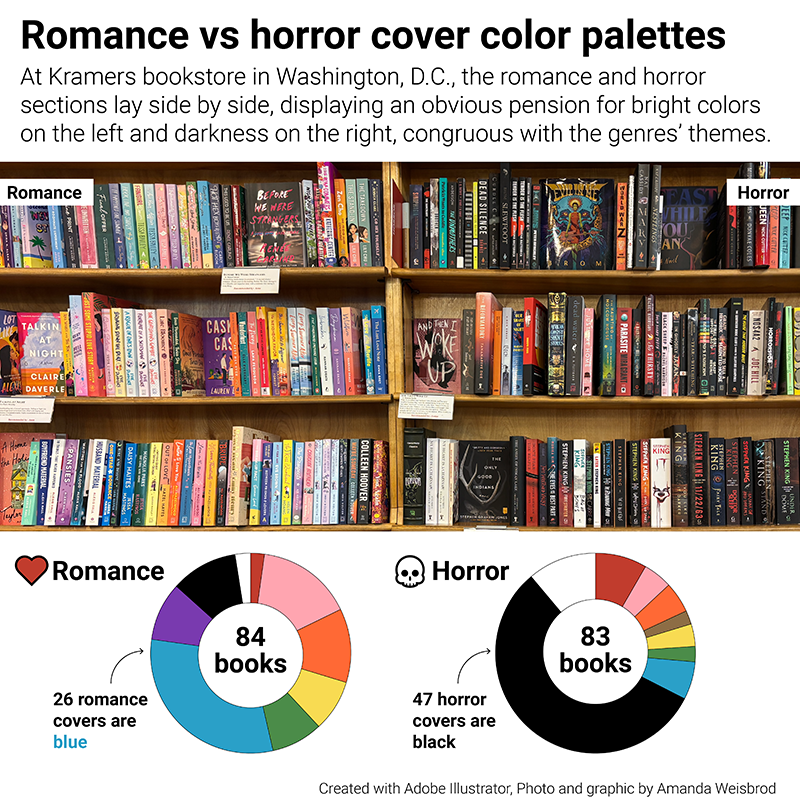
A graphic I made about the book covers in a local D.C. bookstore, featuring two pie graphs that could've been a bar chart or better yet, a table. (Amanda Weisbrod)
I feel the urge to experiment more with tables in small datasets from now on, perhaps embedding “sparklines” or small, high-resolution graphics (p. 172) within to give them depth and a way to easily compare trends. Tufte states that visual communication is second nature to humans and can convey information in a fraction of a second compared to words alone. Our eyes immediately search for patterns and can determine variances in those patterns instinctively as a result of our evolution. This is why visual communication is so important — conveying data and stories in this way allows readers to comprehend complex ideas at a glance. And for the more intricate graphics, allow for exploration.
All in all, to me, tables could be great for small datasets if the intention is for the reader to explore the exact numbers; otherwise, graphical visualizations are better. It all depends on the purpose of your design. “What are you trying to communicate? What are you hoping your readers will learn?” These are the first questions I ask myself when designing graphics, and the follow-up is “How can I make this more interesting?”
I struggle with designing innovative graphics that break the rules. I find myself leaning on bar charts and line graphs more often than not. While I know there’s nothing wrong with these tried-and-true approaches, I hope, in the future, to create more engaging and revolutionary designs. But Tufte stresses it’s important not to let the design get in the way of the data. He writes about “maximizing data-ink,” or the practice of communicating as much information in as little ink as possible by avoiding “chart-junk,” or non/redundant data-ink. Examples of chart-junk include unintentional optical art, the “dreaded” grid, and the self-promoting graphical duck.
A graphical duck is when a graphic is taken over by decoration. Once I read the definition, this example came to mind:
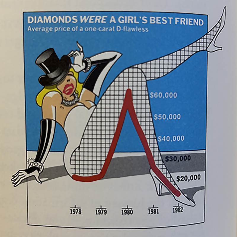
A photograph of Nigel Holmes' "Diamonds were a girl's best friend" graphic from Edward Tufte's book, Envisioning Information. (Amanda Weisbrod)
Here, we see not only is this chart sexualizing data (weird), but its decoration is getting in the way of communicating the point of the graph: to visualize the trend of diamond purchases over time. It also includes a dark, thick, dreaded grid in the form of fishnets (again, weird). Instead, Tufte writes grids should usually be muted or completely suppressed so they don’t compete with the data. Using grey instead of black is a good practice, and one I try to incorporate in my designs.
The grid and angle of the leg in this example also create an optical illusion called a “moiré effect,” which causes vibration of the eye and is generally painful to look at. Other examples of unintentional optical art include using cross-hatching or slanted lines as a fill. (Even though Tufte writes that patterns are chart-junk, I wonder if it’s not all bad to include faint patterns if it helps with accessibility, such as color blindness.)
Tufte includes an excerpt from Learning from Las Vegas, which covers ducks in modern architecture: “It is alright to decorate construction, but never to construct decoration” (p. 117). Even though this quote is referring to architecture, it’s extremely relevant to graphics design, which is, I’m sure, why Tufte included it in his writing.

Edward Tufte took this photograph of a building shaped like a duck to illustrate the concept of a graphical duck. (Amanda Weisbrod)
The best ways to avoid chart-junk and design with intention are to maximize the data-ink and data density of a display. To achieve optimal data density, one should look at the number of entries in the data matrix divided by the area of the data display. Tufte writes that data-dense designs give control of the information over to the readers, while data-thin displays move readers toward ignorance and passivity.
The assumption that charts are for readers who find text to be too difficult to understand results in designs that aim to entertain rather than inform. “Contempt for graphics and their audience leads to over-decorated and simplistic designs, tiny datasets and big lies,” (p. 81), according to Tufte. He goes on to explain that the skills, attitudes and organizational structure among those who design and edit are the primary causes of inept graphics.
As this book was originally published in 1983 (I read the second edition, which was released in 2001), I feel we’ve come a long way in the field of data visualization, especially in the realm of news. Most designs I see published in major news outlets are sophisticated and explore data in meaningful ways, while avoiding chart-junk. I believe visual graphics journalists are now more in tune with statistics, and the myriad of intuitive tools available give easier access to statisticians to design graphics. We see a melding of the two professions in this case. I’d like to explore the trajectory of the visual data journalist profession over time — when it first emerged, and how it has boomed over time alongside the advancement of technology, particularly design programs — but I feel that’s another article to be written.
That’s all for now! Thanks for following along, and I’ll see you next time.