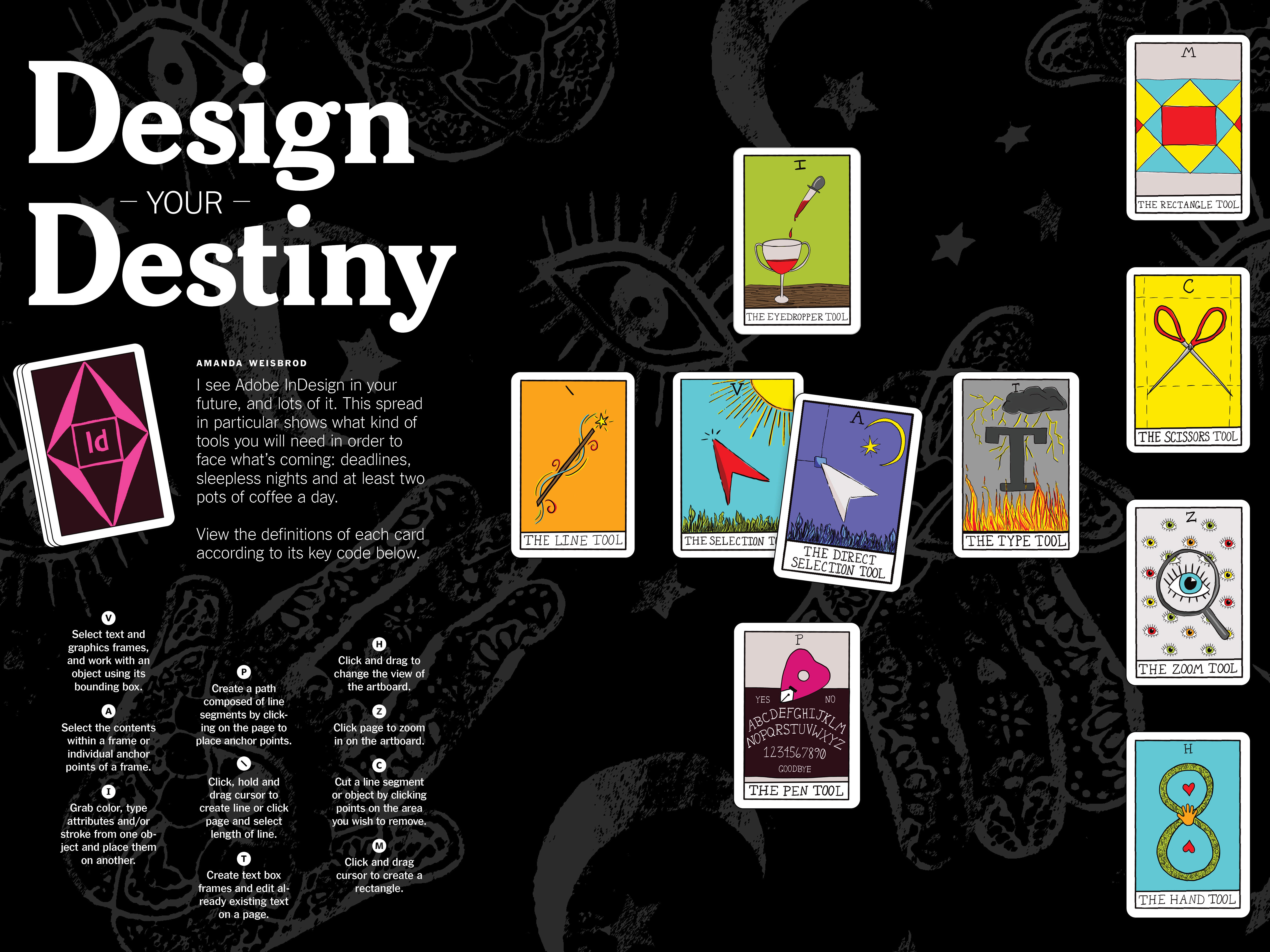
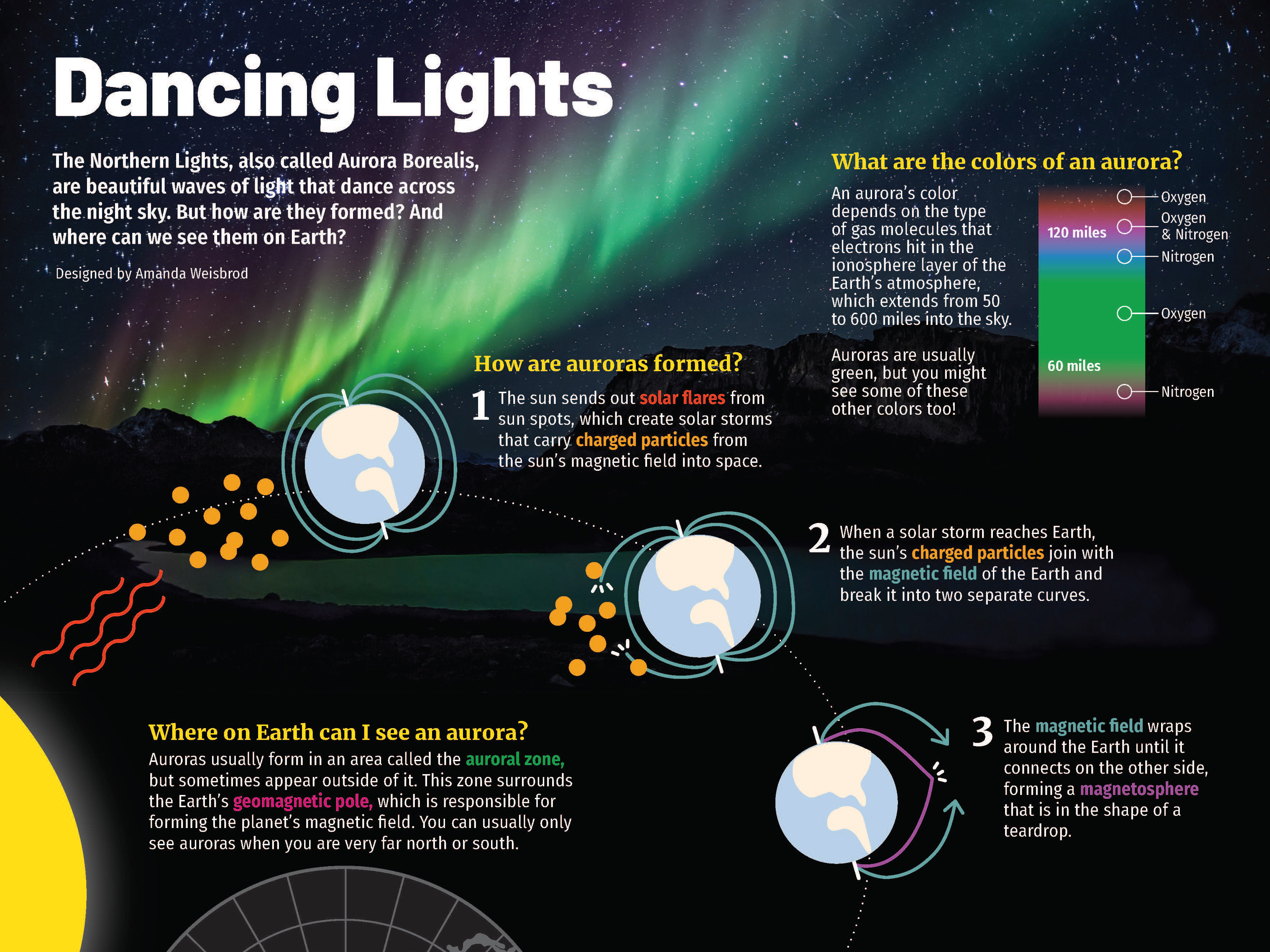
Concept: For my graduate-level photo editing class, I was assigned to work with a partner to design a magazine spread featuring a photo story in a mock issue of New York Times Magazine. Out of our two story options, my partner and I chose "The Girl in the Window" because of the strong emotional pull and beauty of these black and white photographs.
We could only choose a limited number of photos out of 70, so we went with pictures that told every part of the story, first showing the girl's past, then her home life, her school life, and finally ending on a photo of her laying in bed, ready to fall asleep.
We included a lot of white space in our layouts in order to give the photos room to breathe and speak for themselves. We introduced text elements such as drop caps and pull quotes in order to guide the reader's eyes along the page in a way that we wanted. Every element on each of these pages was placed purposefully and thoughtfully.
Work: My partner and I split the work evenly. We each selected our favorite photos then chose the ones we would use together. We designed the cover layout together using screen share on Microsoft Teams. Finally, we each designed two spreads while communicating with one another throughout our creative process in order to create a unified package.
Challenges: Working remotely on a collaborative project is always difficult, and although that was a challenge we faced, I felt my partner and I handled it well. She and I disagreed about a few things here and there, but we were able to discuss them and come to a decision without issue.
Programs: Adobe Bridge and InDesign
Timeline: 1 week


